Part 2 (of many) . . . .Links to: Part 1. . . . .Part 3
In Part 1 we covered the October 31, 1969, review of the SF Lamplighter’s production of The Mikado in the Stanford Daily. We know it was written by an aficionado of The Mikado and Gilbert & Sullivan, but there is no byline so we don’t know who wrote it. In Part 2 we will address the really bad layout of this article.

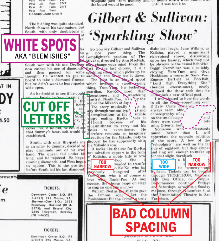
The layout of the Mikado review is somewhat peculiar. It seems to be placed on the page hurriedly; it has graphic mistakes, layout mistakes. I noticed that some of the letters in the left-hand column of the article are cut off. Starting at the bottom of the second paragraph and continuing through most of the third, the left-most letters are cut off.
Upon closer examination, what appears to be happening is not so much that the letters are cut off, but rather that the paragraph to the left, a part of a column about bridge, was actually pasted too far to the right, and some of the white paper of that article was went over the letters of the Mikado review, cutting them.
This is sloppy paste-up. Paste-up is the term used to describe the method to design and produce printed pages before desktop publishing took hold. It was a very hands-on process and required a steady hand and precise artistic skills. This is very poor layout work, uncharacteristic of layout artists, who tend to be precise and proud of their work.
A second sloppy thing about the layout of the Mikado review is that the space between the two columns of the review is very wide, wider than the space outside the columns. This is breaking some of the most basic rules of layout, and again looks hurried, slapdash. What’s more, this wide space would have presented an easy fix to the previous problem mentioned. There is plenty of room to make the space between the two Mikado article columns thinner, and thus the Bridge column would not have overlapped. But this very simple fix was not done.
The layout of the Mikado review is quite poor, and as such it is quite unique. I haven’t found a layout this sloppy looking across many, many Daily issues and literally thousands of articles. Isn’t it a funny coincidence that a Mikado review, already so Zodiac-esque, would be one of, if not the poorest laid out article found, ever?
And there is yet another bit of poor quality regarding this article–the printing of the review contains two white spots, or blemishes, obscuring some of the text on each column. The larger of the two spots obscures quite a bit of text. The combination of the spots, the cut off letters, and the poor layout artist work, makes the Daily’s Mikado review peculiarly bad. Whether that is a coincidence, I do not know.
That said, the layout of the Mikado review is so sloppy, it makes one wonder if it was made under duress, or trying to work too quickly, or by someone in an excited emotional state.
Link to the Sparkling Mikado Review in the Stanford Daily Archives.
Except from the book, pages 283-284. Stay tuned for Part 3.

Leave a comment